What do you do when your new BTO feels smaller than expected? Well, our designer Nadia racked her brain and did a quick switch of materials!
When our newlywed clients first approached us back in March of 2020, they asked for a colour palette that is “something dark but not gloomy”. We initially proposed a spread of deep and bold colours, with a mix of glossy and natural textures for a more lively approach to the home.
Switching it up
The reality of the unit size dawned upon us when we did our first site walkthrough, with the proposed dark colours exacerbating the perception of a smaller space.
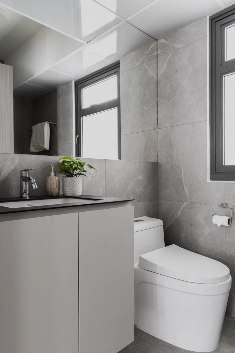
In maintaining the essence of our client’s original preferences, we advised the use of colour contrasts instead, injecting more white in their space with splashes of heavier, darker accents. This impacted the general vibe of the home, allowing it to feel wider and more spacious.
Behold, a light and airy space injected with subtle textures and contrasting colours!
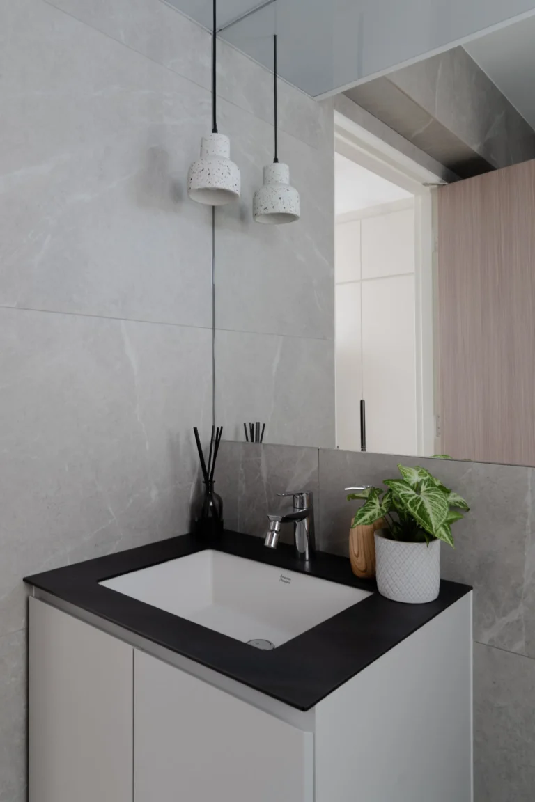
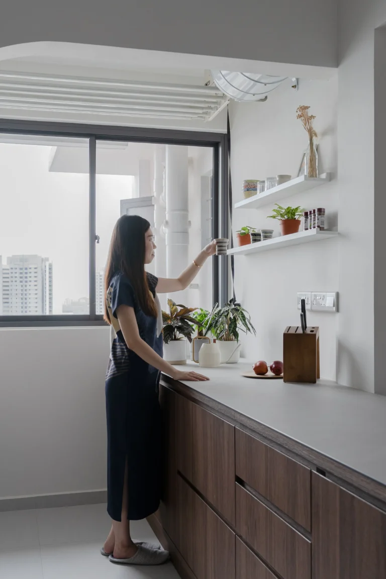
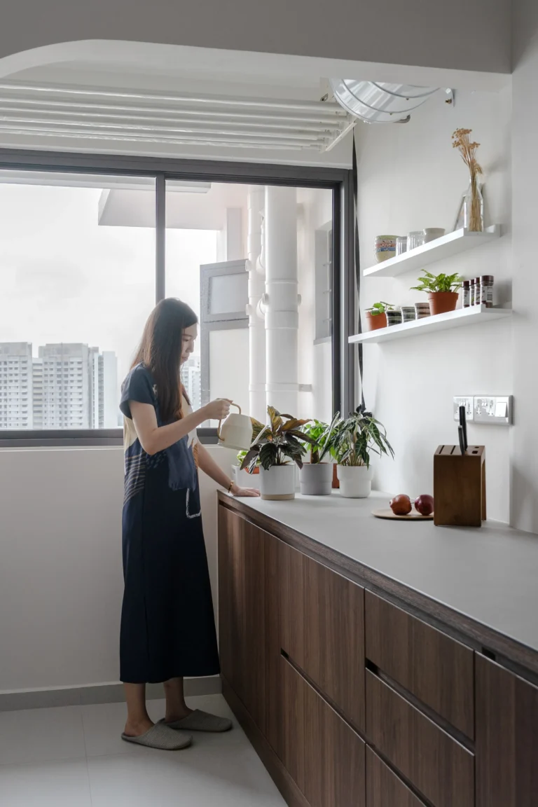
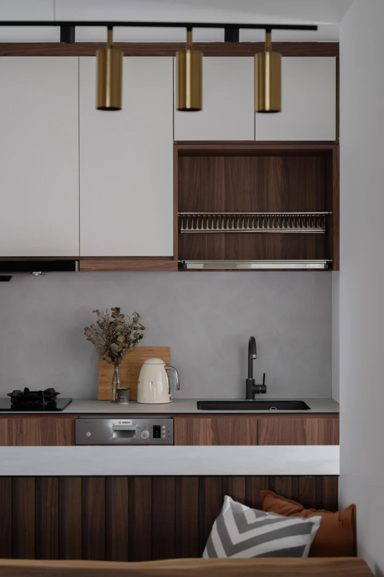
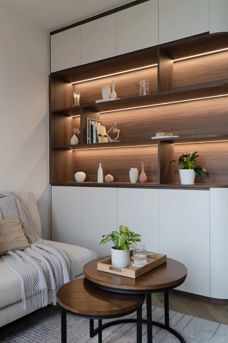
With the moodier palette no longer the main colour scheme, the deeper tones were translated into dark, raw materials for a bolder contrast. While we specified the main surfaces around the home to be white, dark-toned wood textures were used in specific areas (such as open shelves) as a striking juxtaposition.
The Layout
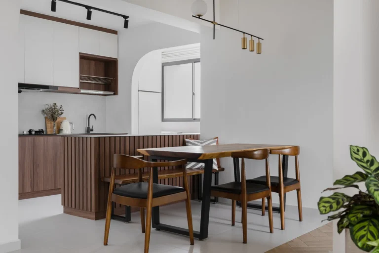
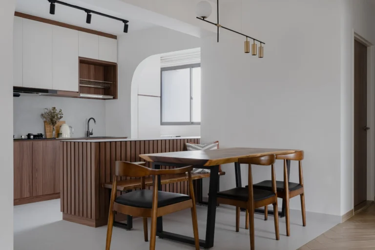
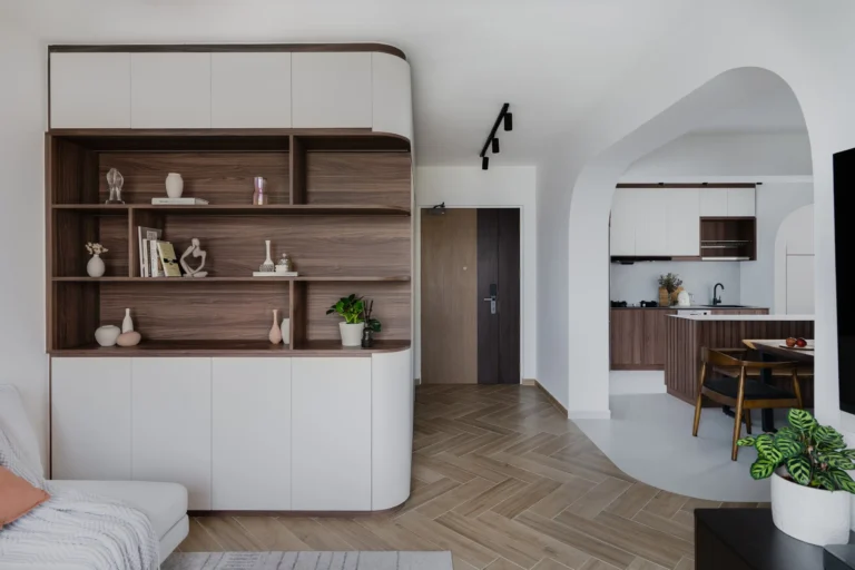
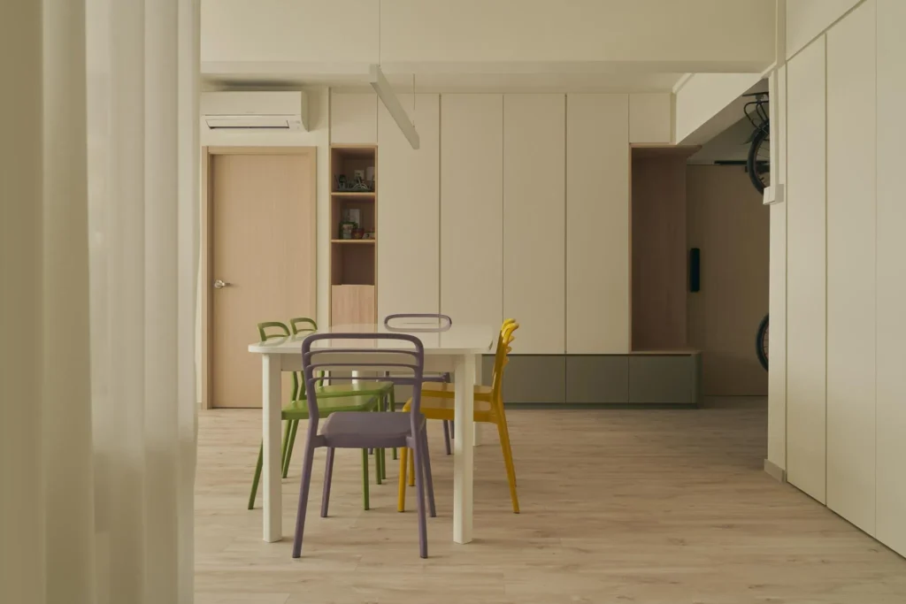
Despite the earlier spatial concerns, we kept most rooms intact for maximum functionality for the couple. The kitchen and service yard walls have been demolished to foster visual connections between all of the social spaces (Living, dining and kitchen), allowing the home to appear more spacious and open.
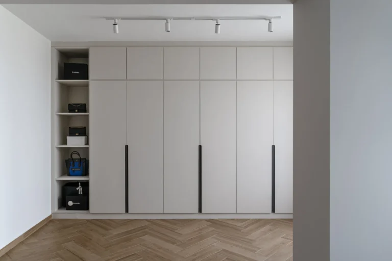
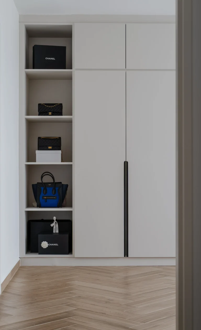
The master bedroom was extended by hacking down the adjacent wall with Bedroom 2, where the king-sized bed currently sits. What was the original master bedroom now houses a walk-in wardrobe, with an open shelf section to display the wife’s exquisite collection of bags.
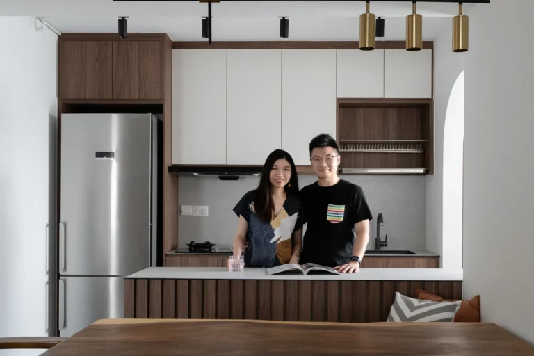
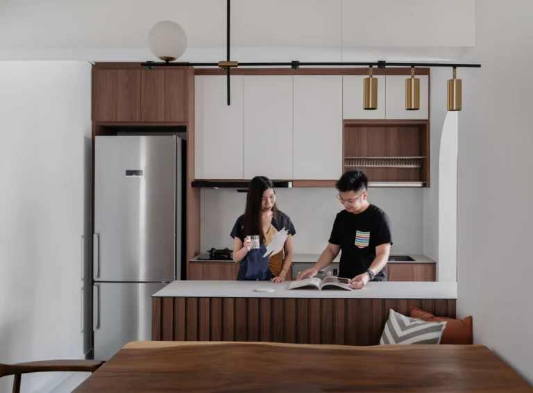
Perks of an open-concept kitchen – keep an eye on your cooking while entertaining your guests!
Opening up and anchoring down
For the anchoring highlight of the open dining/kitchen region, Nadia designed a peninsula counter cladded with fluted panels that doubles up as a backrest for the dining bench. As with our client’s wishes, we were able to fit in a large suar wood table to complete the central focus.
The kitchen area is further defined through the curved boundary between the wood-textured herringbone and cream floor tiles, all while maintaining a natural flow throughout the social spaces. Our clients would be able to cook while entertaining their guests all the way to the living area.
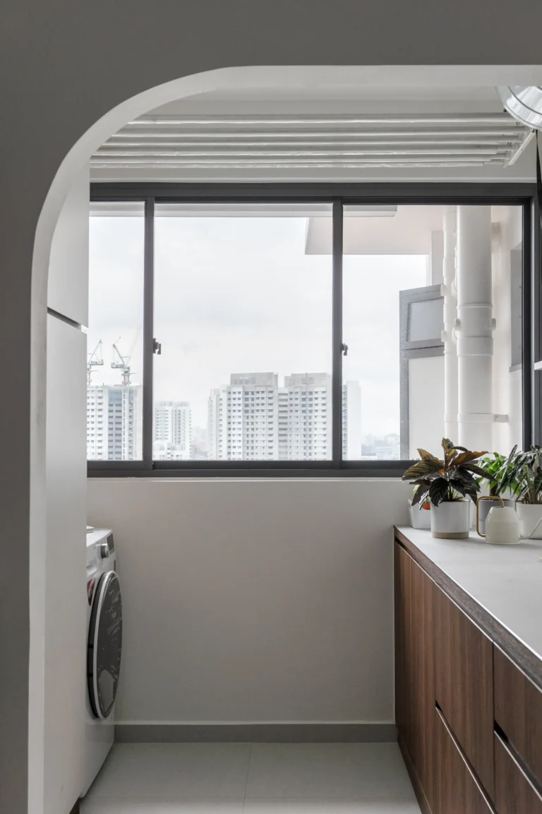
Following the flow of the curves
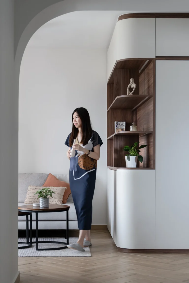
Tight corners and harsh angles are no-gos for small spaces, which we managed to soften by smoothening the intersections between beams and walls. We also built an additional layer of storage cabinets around the household shelter, with a rounded corner and open shelving that acts as a feature wall facing the living area. As a result of the overlapping arched elements, small pockets of spaces blend seamlessly with each other, while creating subtle visual movements through the spaces.
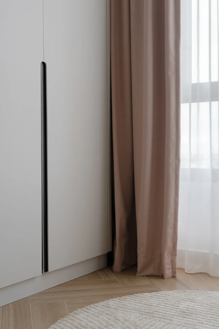
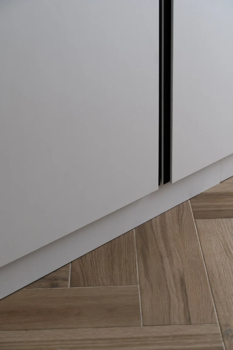
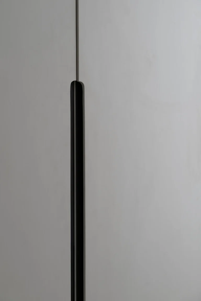
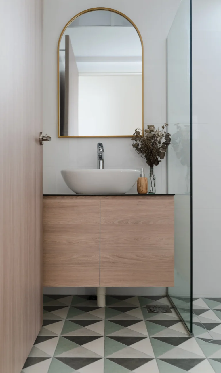
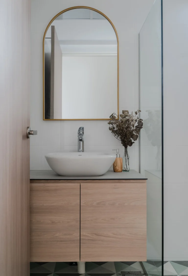
The curved design language can also be seen in minute details through the house, such as the recessed finger grooves of the wardrobe doors as well as the arched mirror in the common bathroom. Of course, this space would not have been complete without our clients’ thoughtful curation of home decor and objects that really brought out the spirit of their humble first home!
Check out the full gallery below, shot by Studio Mahogany
Hear about this project from our clients’ point of view here!